
In the ever-evolving world of fashion, the ability to wield color effectively is a potent tool. Your choice of colors can transform an ordinary outfit into a stylish ensemble that speaks volumes about your personality. To navigate this realm with finesse, understanding the color wheel for clothing matching is paramount. This comprehensive guide will walk you through the nuances of the color wheel, helping you craft outfits that turn heads and leave a lasting impression.
Understanding the Color Wheel
The Basics
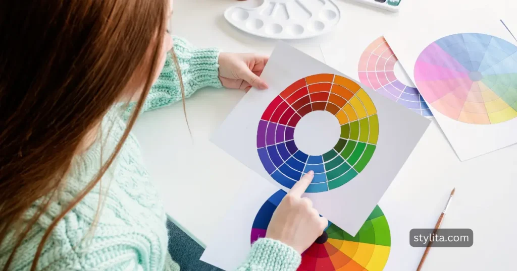
At the heart of color theory lies the color wheel, a visual representation of the relationships between colors. Primary colors—red, blue, and yellow—form the foundation, giving rise to secondary colors through combination. Tertiary colors, the offspring of primary and secondary hues, complete the spectrum. Understanding this basic structure is the first step to unlocking the potential of the color wheel.
Color Harmony and Contrast
Complementary Colors
Dare to make a bold statement by pairing complementary colors—those opposite each other on the wheel. Think red and green or blue and orange. The stark contrast creates a visually dynamic and attention-grabbing combination.
Analogous Colors
For a more harmonious look, turn to analogous colors—those adjacent on the color wheel. Blues and greens or reds and oranges provide a pleasing and balanced palette, perfect for a sophisticated yet cohesive ensemble.
Triadic and Split-Complementary Schemes
Expand your color horizons by exploring triadic schemes, incorporating three equidistant colors on the wheel. Alternatively, opt for split-complementary schemes, introducing a nuanced twist to traditional complementary combinations.
Warm and Cool Tones in Clothing
Understanding the warmth or coolness of colors is a game-changer when assembling outfits.
Warm Colors
Warm colors infuse energy and vibrancy into your wardrobe, creating a lively and dynamic look. Reds, oranges, and yellows are the quintessential warm tones. Red, a color of passion and intensity, demands attention and can be used as a focal point in an outfit. Orange radiates warmth and friendliness, making it an excellent choice for a cheerful and approachable appearance. Yellow, the color of sunshine, adds a burst of optimism and positivity to any ensemble.
The key to mastering warm colors is understanding how to balance their intensity. Use warm tones strategically, either as statement pieces or in combination with neutral colors to prevent overwhelming the senses. Warm colors are particularly flattering on individuals with cool or neutral undertones, adding a vibrant touch to their overall look.
Cool Colors
Cool colors, on the other hand, evoke a sense of calmness and sophistication. Blues, greens, and purples are the classic cool tones. Blue, a symbol of tranquility, is a versatile and universally flattering color. Greens, reminiscent of nature, exude a refreshing and balanced vibe. Purples, often associated with luxury and creativity, add a touch of elegance to any outfit.
Cool colors are ideal for creating a serene and composed aesthetic. They work well in professional settings and can convey a sense of confidence and reliability. When working with cool tones, consider incorporating various shades to add depth and interest to your ensemble.
Neutral Colors and Their Versatility
The Power of Neutrals
Black, white, gray, and beige serve as the backbone of a versatile wardrobe. These neutral tones act as a canvas, allowing bolder accents to shine. Learn the art of balancing neutral foundations with pops of color for a timeless and polished look.
Neutral colors are the building blocks of a well-rounded wardrobe. Black, the epitome of sophistication, adds a touch of mystery and elegance to any outfit. White, a symbol of purity, brings a sense of freshness and simplicity. Gray, a versatile and understated color, serves as an excellent backdrop for both warm and cool tones. Beige, a neutral earth tone, complements a wide range of colors and can be used to create a chic and understated look.
When working with neutrals, pay attention to the undertones to ensure a cohesive and harmonious appearance. Mixing different neutral tones can create dimension and interest without overpowering the overall look.
Seasonal Color Analysis
Discover Your Season
Embark on a journey of self-discovery with seasonal color analysis. Determine whether you align with the vibrancy of spring, the warmth of summer, the richness of autumn, or the cool elegance of winter. This insight guides your color choices, ensuring a harmonious relationship with your natural palette.
Common Color Matching Mistakes to Avoid
Clash of Conflicting Colors
A discerning eye is crucial in steering clear of color clashes that create visual chaos. Recognize the potential pitfalls and master the skill of selecting colors that enhance, not detract, from your overall look.
Overuse or Underuse of Color
Strike the delicate balance between too much and too little color. Avoid monotony by introducing a variety of hues, but ensure your outfit doesn’t overwhelm the senses.
Color Wheel Tools and Apps
Online Resources
Navigate the digital landscape with user-friendly tools and apps designed to simplify color matching. These resources empower you to experiment with color combinations and refine your wardrobe planning with ease.
Case Studies and Examples
Real-Life Inspiration
Delve into practical examples showcasing successful color combinations in various contexts. Learn how to translate these principles into your everyday wardrobe, adding a touch of flair to your fashion repertoire.
Tips for Experimenting with Colors
Gradual Introduction to Bolder Colors
If the idea of vibrant hues is intimidating, start small. Gradually introduce bold colors into your outfits, observing the transformative impact on your style with each experiment.
Mixing Patterns and Textures
Elevate your fashion game by mastering the art of combining colors with different patterns and textures. This advanced technique adds depth and sophistication to your overall look.
Personalizing Your Color Palette
Consider Your Features
Tailor your color choices to your unique features—skin tone, hair color, and personal preferences. This personalized approach ensures your wardrobe is a true reflection of your individual style, fostering confidence in every outfit.
Conclusion
In conclusion, the color wheel is a dynamic tool that can elevate your style to new heights. Armed with the knowledge of color theory, you have the ability to curate a wardrobe that not only complements your features but also tells a story. Embrace the color wheel, experiment with confidence, and watch as your fashion sense becomes a masterpiece that turns heads and leaves a lasting impression. Your journey to mastering the art of color in clothing has just begun.